When your job is to write about decor trends and the country's most gorgeous houses, it's expected you'd live in a photoshoot-worthy home yourself. But while the Homed team routinely scrutinise other people's houses for publication-worthiness, our own abodes often wouldn't make the grade. I cast a critical eye over my place and came up with five reasons it wouldn't be featured in Homed.
THE WALLS ARE BARE
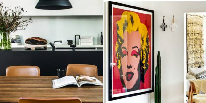
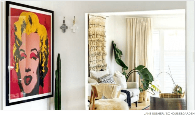
I love art and have the odd piece hung up but have far too many boring white walls for my home to ever look compelling in a photograph. I covet things that are out of my budget, while everything else seems too commonplace.
The fix: Having champagne tastes on a beer budget isn't going to change overnight but I could start by hanging up a few more favourite family photos that are languishing un-printed on my computer.
THERE ARE TOYS EVERYWHERE
Like many other parents, I once swore my kids would only have a select few toys that were aesthetically pleasing and educational. Oh how I laugh at my naivety now that I'm surrounded by baskets overflowing with Nerf guns and dismembered superheroes.
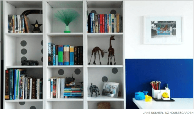
The fix: My children have way too much stuff and some of it definitely needs to go, but a lot of it they are genuinely and deeply attached to. Better storage should be a priority as scooping everything up and dumping it into a basket is a quick, but ultimately impractical, fix. "There are lots of fun storage boxes and containers out there now for kids rooms," says Coleman. "Donate those toys that really are not being used and send to a good home. I do a blitz when they're not looking, it makes life a lot easier!"
IT LACKS COLOUR AND TEXTURE
White walls and wooden floors are a classic combination, but they've become so ubiquitous that it's a challenge to make them look magazine-worthy. When we bought the couch and most of the soft furnishings I liked black and white, but it's not layered up enough to be interesting.
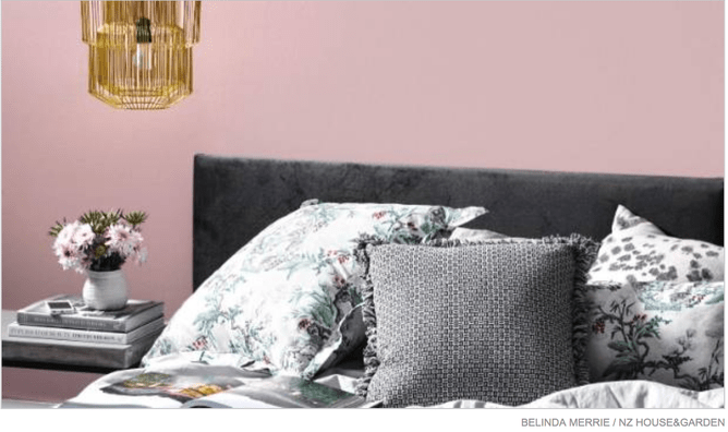
The fix: Breaking up expanses of flat, monochromatic surface is essential. Colour-phobes should experiment with different finishes. Coleman says: "Introduce texture with rugs and cushions, to add variety and interest to flat boring areas. A vase of flowers, grouping of books on a coffee table can all add warmth and interest to the room."
THERE'S NO COHESION
Another reason homes don't pass the standard for publication is a lack of cohesion. It's not a matter of having a uniform look, but a common thread running throughout the home gives the reader a better sense of its flow on the page or screen. Our place has touches of Scandi, industrial, boho, Mid century and, er, mediocre-chic. Eclecticism requires commitment to execute well.
The fix: The first step is to take a big picture view of the house and decide what look and feel you're going for. Remove or reposition items that are out of place.
THE KITCHEN IS BLAND
Our kitchen is modern, functional and insufferably beige. I never would have chosen to install the bland cabinets and speckled faux stone benchtop but it was brand new when we bought the house and it's way too wasteful to rip it out after only four years.
The fix: There isn't a lot of bench space but there definitely is some ugly clutter that could be moved out to make way for some more attractive and functional items.
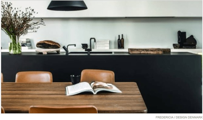
Coleman says boring kitchens can be added to. "Introduce an accent colour in the form of a toaster, kettle, drying up cloths. Add a big vase of flowers at the end of the kitchen island/bench, and herbs to add a touch of green and texture. Introduce wood, it softens it and adds texture too, in the form of a wooden bowl with fruit, a lovely big cheese board."
